
Colour Me Happy
How does colour make you feel and how do you use it.
~Do you find joy in various colour combinations that complimentary dance excitedly side by side, or do you prefer subtlety, soaking in soft tones feeling relaxed.
I am a massive colour lover!! But do I really get it?
At work, (I’m an art instructor at ARTHOUSE Unlimited - A charity presenting artistic talents of adults living with complex neuro-diverse and physical support needs.) I have struggled to understand the concept of a sophisticated colour palette and tend to stick with the same winning formulas, I know the results work. In my own artwork everything goes out of the window, I’m intuitively picking up whatever I like and the more bright and shiny, complimentary entry and clashing all the better. Although I do love my paintings top date and am proud of what I have created, they are pretty much loud and in your face, screaming for attention - (Pretty much the opposite to my self as a person)
So what I’m creating then is the loud conversations, although it is full of opposites and differences in textures and colours the core values and noise is very similar. What man I trying to say then?
I’m looking at new ways of creating difference, and I’m searching for space. It sounds so simple - just leave bits empty and yet it feels alien to me. I want to be able to feel the freedom of space connected with nature.
How does this work with colour?
I’ve spent years and years dismissing brown and black, in favour of the darkest shades of purple and blue. I am learning that muddy colours actually set the contrast in the values of the bright colours in a painting, so much more than clashing complimentary colours that have similar values. The easiest way of understanding or seeing this is by taking colour out all together. By taking a black and white photograph, can you see if the balance in composition is still there. or has everything turned dull and grey, a mix mash of midtones.
Interestingly, up until now I have had accidental muddy colour form and appear as liquid paint mixes mid-air in a throw. It is precisely this that has given the painting more depth, the colours I would never have chosen yet somehow find their way in.
Mother nature in all her earthy colours, finds her way.
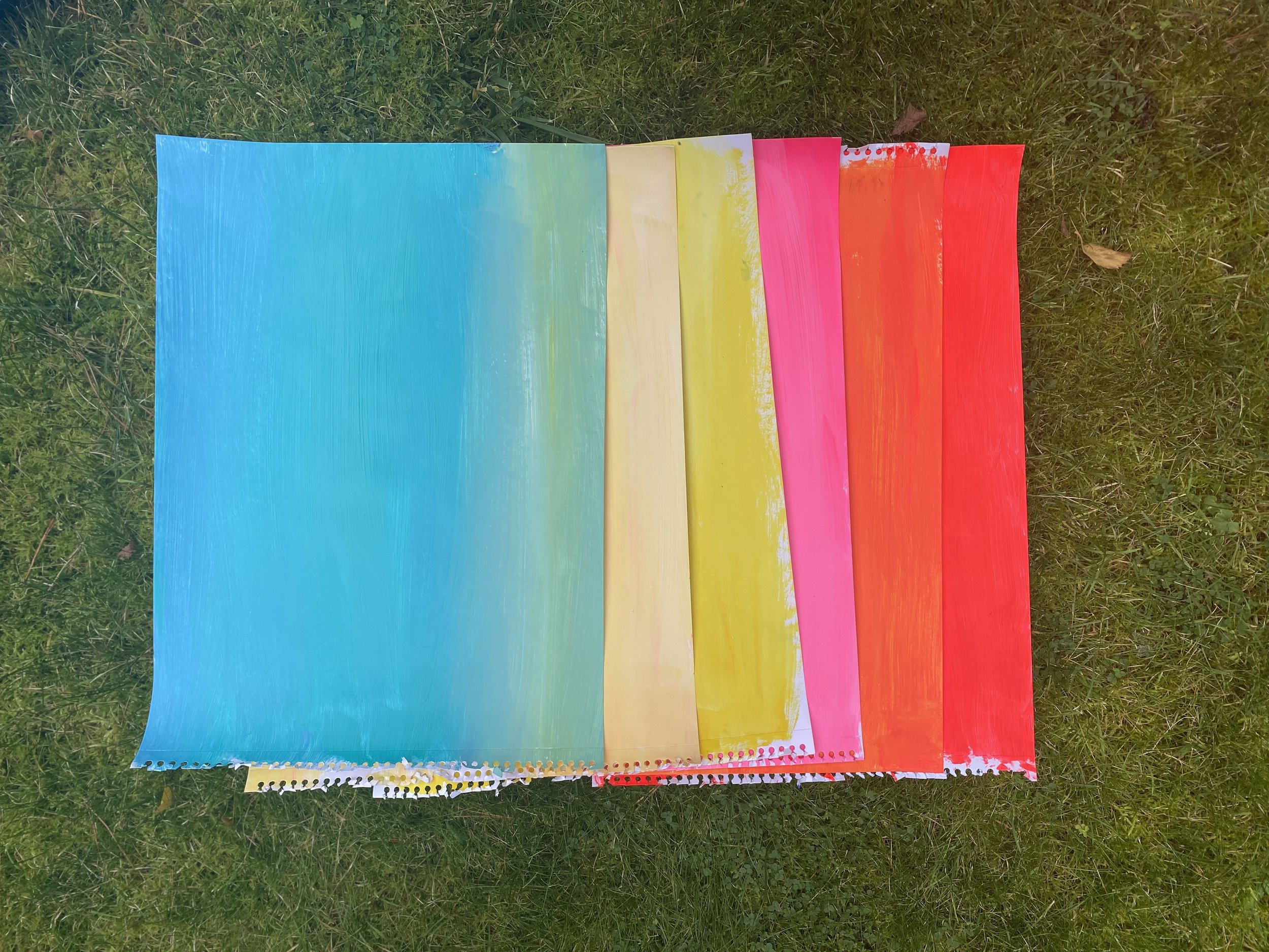
Colour swatch fun, looking at colour combinations.


Here is something old and new. A couple of swirls on a small 30cm x 30cm canvas, a base layer for something from. a year ago or so. I thought Id just casually add in some cut outs, it worked pretty well, the bold sharp edges and colour against the soft subtle curved flow of brushstrokes. I like that there its depth and space and contrast. It feels like a happy song of differences.
